What’s that you say? You’re a household name running a special on a well-known product? Well since you’re not going to tell anyone anything they don’t already know, you gotta get wacky!
Refuse to be ignored.
This song has been in my head all day.
Showing posts with label advertising. Show all posts
Showing posts with label advertising. Show all posts
Thursday, March 5, 2009

Friday, February 27, 2009
Two-Sentence Review: Coke Zero’s “Mean Troy” Spot
I was going to post this Coke Zero spot and rant about how awful it is and, even worse, how this spot sucks all the emotion from the original leaving it as a heap of used up trash at our collective feet and eliminating our ability to hold onto the feelings we associated with the original while simultaneously destroying a piece of great American advertising for a cheap and unfunny gag, but I decided I didn’t want to be that guy. Then I decided I am that guy after all.
Friday, February 13, 2009
Celebrex probably won’t kill you
 I saw the latest version of this Celebrex spot the other night and was amazed.
This is advertising? It’s a 2-minute warning label oration.
Among the key highlights: “Celebrex has never been taken off the market.”
Well in that case, sign me up!
Wednesday, December 17, 2008
Yellowbook doesn’t get it
A few years ago advertisers figured out that one way to get consumers to visit their websites was to run TV spots that showed just the first part of a two-part story. Curious TV viewers were required to visit advertisers’ sites in order to see the end of the story and get closure (and thereby be able to sleep at night).
This device actually worked OK for some early executions of it. If the story is compelling enough, and the target is right, and the product or service makes sense for such an action, it can drive traffic.
Yellowbook, and its latest spot, does not fit the above criteria.
Ooh, what in the world will she do?! She’s been so wronged by this awful boyfriend! Perhaps I’ll go the site and help her make a decision and put her back on the right track! Oh, what fun!
Not.
This device actually worked OK for some early executions of it. If the story is compelling enough, and the target is right, and the product or service makes sense for such an action, it can drive traffic.
Yellowbook, and its latest spot, does not fit the above criteria.
Ooh, what in the world will she do?! She’s been so wronged by this awful boyfriend! Perhaps I’ll go the site and help her make a decision and put her back on the right track! Oh, what fun!
Not.
Thursday, December 4, 2008
You ain’t the Dukes of Hazzard
Awesome long-format commercial for Jones Big ASS Truck Rental & Storage.
Check out the website too (this is my nomination for best business URL of 2008). Toby’s bio is not to be believed.
I called the phone number but the mailbox is full. Toby’s voice is on it, though.
Thanks, DT.
Check out the website too (this is my nomination for best business URL of 2008). Toby’s bio is not to be believed.
I called the phone number but the mailbox is full. Toby’s voice is on it, though.
Thanks, DT.
Strange bedfellows
Has anyone else seen this? When I first caught it the other night I was surprised to see what I thought was Cloud Cult selling out to an insurance company.
As I watched the spot I kept waiting for the sell, but it never came.
I scratched my head and wondered, “Esurance is suddenly spending their media dollars to promote bands they like?”
Which immediately led me to a second thought: "Esurance likes bands?"
According to the site, Esurance and Cloud Cult met up at the 2007 Monolith Festival, and they bonded over their mutual passions for environmental friendliness. According to Craig Minowa, leader of Cloud Cult and an environmental scientist (really?), Esurance has been “incredibly friendly and supportive of our environmental goals. We wouldn’t do something like this if those ethics weren’t adhered to.”
So Esurance animated the band for a full-length video and runs a 30-second version on TV.
In these tough economic times, when many companies are surely slashing marketing budgets, it’s a bit shocking to see a company go this route.
Here’s the full song/video, available on the Esurance site:
Also, check out the Esurance/Cloud Cult site for free downloads of three Cloud Cult songs.
As I watched the spot I kept waiting for the sell, but it never came.
I scratched my head and wondered, “Esurance is suddenly spending their media dollars to promote bands they like?”
Which immediately led me to a second thought: "Esurance likes bands?"
According to the site, Esurance and Cloud Cult met up at the 2007 Monolith Festival, and they bonded over their mutual passions for environmental friendliness. According to Craig Minowa, leader of Cloud Cult and an environmental scientist (really?), Esurance has been “incredibly friendly and supportive of our environmental goals. We wouldn’t do something like this if those ethics weren’t adhered to.”
So Esurance animated the band for a full-length video and runs a 30-second version on TV.
In these tough economic times, when many companies are surely slashing marketing budgets, it’s a bit shocking to see a company go this route.
Here’s the full song/video, available on the Esurance site:
Also, check out the Esurance/Cloud Cult site for free downloads of three Cloud Cult songs.
Monday, December 1, 2008
Super Floss holiday gift guide
Unsure of what to get that special someone for the holidays? Not since the Hawaii Chair has there been a product quite as exciting as this.
One benefit not mentioned: it’s sexy!
One benefit not mentioned: it’s sexy!
Tuesday, November 25, 2008
Animated type is the new black
Some of you may remember the videos I posted back in May—one was all animated type about the Internet as tool for idea-sharing that will ultimately enable things that wouldn’t be possible otherwise, the other was the awesome “I Met The Walrus” animated short—both of which are really cool and use engaging animation. One animates type with no voiceover, the other illustrates visually the words being heard (in this case, and interview with John Lennon).
More recently, I posted a video called the Girl Effect. All animated type. No voiceover. Emotionally moving.
Earlier this month, Starbucks released an animated type spot that was a bit similar to the Girl Effect spot. It’s emotional and inspiring and promotes a good cause (voting).
Watch it here if you haven’t seen it already:
Now Ford has a new campaign for the F-150 that uses animated type in a style similar to what we’ve seen over the past six months or so. The animation adds a layer of content to the spots, does a see-say thing with the voiceover and animates in an engaging and playful way.
See one of the spots here:
What are we to think of this F-150 campaign? For that small group of us who are aware of the things that influenced it, it may seem like Ford is repurposing (for evil—sorry, I’m just saying it) some pretty cool stuff. Borrowing interest, as it were.
This is how fashion trends die and evolve. Some hot guy or girl wears something interesting. A few early adopters see it, buy in and follow along. Eventually some not-so-hot or not-so-hip folks become aware and join in. And just like that, the party’s over. No one “cool” would be caught dead wearing it.
It’s hard work, folks. And it makes me tired.
More recently, I posted a video called the Girl Effect. All animated type. No voiceover. Emotionally moving.
Earlier this month, Starbucks released an animated type spot that was a bit similar to the Girl Effect spot. It’s emotional and inspiring and promotes a good cause (voting).
Watch it here if you haven’t seen it already:
Now Ford has a new campaign for the F-150 that uses animated type in a style similar to what we’ve seen over the past six months or so. The animation adds a layer of content to the spots, does a see-say thing with the voiceover and animates in an engaging and playful way.
See one of the spots here:
What are we to think of this F-150 campaign? For that small group of us who are aware of the things that influenced it, it may seem like Ford is repurposing (for evil—sorry, I’m just saying it) some pretty cool stuff. Borrowing interest, as it were.
This is how fashion trends die and evolve. Some hot guy or girl wears something interesting. A few early adopters see it, buy in and follow along. Eventually some not-so-hot or not-so-hip folks become aware and join in. And just like that, the party’s over. No one “cool” would be caught dead wearing it.
It’s hard work, folks. And it makes me tired.
Monday, October 13, 2008
More Nike goodness
In case you didn’t see this new Nike spot that aired during yesterday’s NFL games…
I get the point raised by Make The Logo Bigger—that it might just as well be a spot for the NFL Network or even the NFL itself—but I don’t see how it would make sense for either of those brands to show the lifespan (to date) of these players. For Nike football, it makes sense.
One anonymous (of course) commenter on Scamp wrote that he/she/it was “waiting for Nike to do something truely [sic] different.” This comment, in my not-very-humble opinion, is an unintelligent load of crap.
If you’re the brand that does this kind of work, that has the consumers’ permission (expectation?) to do it, and doing so makes sense for your brand, you don’t switch to something else just to be different. Different is what everyone else gets to do.
And it kills them that they can’t do what you do.
I get the point raised by Make The Logo Bigger—that it might just as well be a spot for the NFL Network or even the NFL itself—but I don’t see how it would make sense for either of those brands to show the lifespan (to date) of these players. For Nike football, it makes sense.
One anonymous (of course) commenter on Scamp wrote that he/she/it was “waiting for Nike to do something truely [sic] different.” This comment, in my not-very-humble opinion, is an unintelligent load of crap.
If you’re the brand that does this kind of work, that has the consumers’ permission (expectation?) to do it, and doing so makes sense for your brand, you don’t switch to something else just to be different. Different is what everyone else gets to do.
And it kills them that they can’t do what you do.
Wednesday, October 8, 2008
Don’t do what everyone else does
So many car commercials are essentially the same. Show the car. Show someone driving it. Show it hugging the curves. Show the interior. Show the logo. And use music and visual styling try to differentiate it from other car commercials.
Some advertisers avoid this, and those can be great spots.
The latest Hummer spot, for the HT3, works well because it makes the vehicle almost an afterthought, but sells the thing at the same time.
It reminds me of a cross between Volkswagen’s “Pink Moon” spot and Nike’s “Before” spot. (Maybe even a bit of Nike’s “Move” as well.)
I don’t see the need for the Braveheart tie-in, though. It takes the spot from inspirational to embarrassing and makes me feel dumb.
Ah, so close.
Via Make The Logo Bigger.
Some advertisers avoid this, and those can be great spots.
The latest Hummer spot, for the HT3, works well because it makes the vehicle almost an afterthought, but sells the thing at the same time.
It reminds me of a cross between Volkswagen’s “Pink Moon” spot and Nike’s “Before” spot. (Maybe even a bit of Nike’s “Move” as well.)
I don’t see the need for the Braveheart tie-in, though. It takes the spot from inspirational to embarrassing and makes me feel dumb.
Ah, so close.
Via Make The Logo Bigger.
Tuesday, September 16, 2008
Leverage the awesomeness for your brand
A few months back I posted the awesome animated short film “I Met The Walrus” (here’s the post). Adverbox has posted three animated spots Cramer-Krasselt/Chicago did for Key Bank that use a very similar animation style and visual-to-audio relationship. They're pretty engaging.
The credits list Tim Tomkinson as the illustrator; he's not the guy behind “I Met The Walrus,” lest you believe otherwise.
See all three spots here.
The credits list Tim Tomkinson as the illustrator; he's not the guy behind “I Met The Walrus,” lest you believe otherwise.
See all three spots here.
Monday, September 15, 2008
Don't get too cute with it, Lincoln
If, like me, you spent the better part of yesterday watching football, you might have seen this ad (which has been running for a couple weeks now).
Despite the cool cinematography, it’s not much of a standout spot visually. So many car ads look alike these days. But if you’re a Cat Power fan then you likely recognized the soundtrack. Chan Marshall has done some great covers in her career and I am in love with the snippet of her doing Bowie’s “Space Oddity.” It’s a bittersweet tune, so right in her strike zone.
Lincoln’s use of the song works for their concept of equating driving the car to space travel, and it probably maps well to their intended audience being that it’s a song they probably know updated for today. The weird part is that it’s maybe not the greatest choice when you scratch below the surface of the song to its messages of detachment and powerlessness.
I also kinda hate the “you’ve really made the grade” lyric closing the spot. I bet somebody—the client, the editor, the account guy—was really proud of himself for making that (not so) subtle point.
(I’d love to get my hands on the full version of this song so that I could write over the mental connection I now have between it and this spot. Here’s hoping.)
Despite the cool cinematography, it’s not much of a standout spot visually. So many car ads look alike these days. But if you’re a Cat Power fan then you likely recognized the soundtrack. Chan Marshall has done some great covers in her career and I am in love with the snippet of her doing Bowie’s “Space Oddity.” It’s a bittersweet tune, so right in her strike zone.
Lincoln’s use of the song works for their concept of equating driving the car to space travel, and it probably maps well to their intended audience being that it’s a song they probably know updated for today. The weird part is that it’s maybe not the greatest choice when you scratch below the surface of the song to its messages of detachment and powerlessness.
I also kinda hate the “you’ve really made the grade” lyric closing the spot. I bet somebody—the client, the editor, the account guy—was really proud of himself for making that (not so) subtle point.
(I’d love to get my hands on the full version of this song so that I could write over the mental connection I now have between it and this spot. Here’s hoping.)
Tuesday, September 2, 2008
Polar bears in New York
This is a really elegant piece of art/marketing communications.

You should watch it (here).
Thanks to DY for sending.

You should watch it (here).
Thanks to DY for sending.
Tuesday, August 26, 2008
Vive la difference
 The folks over at Brand Flakes for Breakfast posted this Burger King outdoor ad today. An example of good comparative advertising.
It reminds me of the first part of this AMC Pacer commercial from the ‘70s. (No, I’m not old enough to remember seeing it on TV. Ass.)
If you want to make a point of comparison between two things, sometimes it’s best just to put the two things together.
Friday, August 1, 2008
Sure he’s handsome, young, charismatic, athletic, inspiring and erudite, but…
Today over at I Can’t Believe It’s Not Better, Ben posted the recent John McCain campaign ad that attempts to weaken the public’s love of Barack Obama by showing how loved he is. Or something.
Oh, and it attempts to get some Britney and Paris celebrity stink on him via simply image association.
As Ben said, the ad seems decidedly unhelpful for the McCain camp since it’s based pretty much on asking a few “tough” questions while showing Obama in a very flattering light (emphasis on the flattering light).
This afternoon, CNN.com’s political ticker announced a new McCain ad that calls Obama “The One.” Here it is:
Is the McCain camp insane?
One would assume Obama’s ads (of which I’ve seen none; are there any?) would promote Obama as the right guy for the job. McCain’s ads are at least partially—if not mostly—about how everyone believes Obama is the right guy for the job.
Wait, what?
Obviously the McCain camp’s strategy is to illuminate what they see as a baseless passion that surrounds Obama and then ask whether or not he really has the ability to lead. But they spend so much energy promoting the Beatles-esque excitement encircling Obama that the McCain ads become Obama ads.
Epic fail.
These ads don’t cause me to question Obama. If anything, they make me want to go to an Obama rally.
Oh, and it attempts to get some Britney and Paris celebrity stink on him via simply image association.
As Ben said, the ad seems decidedly unhelpful for the McCain camp since it’s based pretty much on asking a few “tough” questions while showing Obama in a very flattering light (emphasis on the flattering light).
This afternoon, CNN.com’s political ticker announced a new McCain ad that calls Obama “The One.” Here it is:
Is the McCain camp insane?
One would assume Obama’s ads (of which I’ve seen none; are there any?) would promote Obama as the right guy for the job. McCain’s ads are at least partially—if not mostly—about how everyone believes Obama is the right guy for the job.
Wait, what?
Obviously the McCain camp’s strategy is to illuminate what they see as a baseless passion that surrounds Obama and then ask whether or not he really has the ability to lead. But they spend so much energy promoting the Beatles-esque excitement encircling Obama that the McCain ads become Obama ads.
Epic fail.
These ads don’t cause me to question Obama. If anything, they make me want to go to an Obama rally.
Tuesday, July 29, 2008
Another rhetorical question
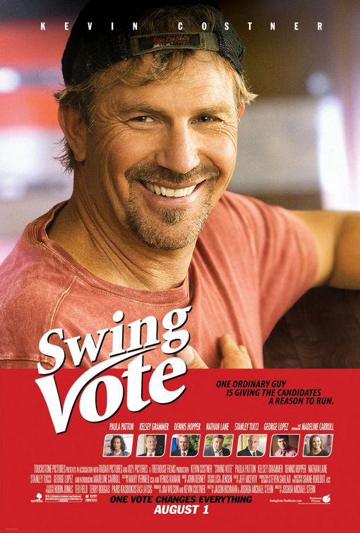
Also about a poster, this one for Touchstone Pictures’ upcoming Kevin Costner vehicle Swing Vote.
Does anyone else think this poster looks like an old cigarette ad? Is it the combination of red, scruff and that damn font?

Better image here (though less cigarette ad-ish due to the familiar movie poster details like credits and images of supporting cast).


Does anyone else think this poster looks like an old cigarette ad? Is it the combination of red, scruff and that damn font?

Better image here (though less cigarette ad-ish due to the familiar movie poster details like credits and images of supporting cast).


Rhetorical question
Doesn’t the very act of making a poster alerting us to Jurassic Fight Club break the first rule of Jurassic Fight Club?


Thursday, July 24, 2008
Is Wendy an agent of Satan?
There’s a post over at Make The Logo Bigger today about Wendy’s advertising and the insanity of a specific recent Wendy’s commercial, wherein the VO claims the salad is “good good.” Granted, that’s an annoyingly stupid line.
Their reference clip is, as they say, “unfortunately one of those typical YouTube hold the camera up and record the TV type jobs.”
More interesting though—and the part that MTLB barely mentions—is the clip’s ending, which brings light to the evil that’s apparently been a subtle (or is it subliminal?) part of the Wendy icon for who knows how long.
It’s waaaay more evil than fast food.
Their reference clip is, as they say, “unfortunately one of those typical YouTube hold the camera up and record the TV type jobs.”
More interesting though—and the part that MTLB barely mentions—is the clip’s ending, which brings light to the evil that’s apparently been a subtle (or is it subliminal?) part of the Wendy icon for who knows how long.
It’s waaaay more evil than fast food.
Monday, July 21, 2008
Dunk you very much
It feels a little odd promoting my own agency’s work on the ol’ blog, but I love this installation for Oreo.
Simple, elegant, great use of the medium, and true to the core of the brand. Look at the smile on the guy’s face at the end. That’s what it’s all about, folks.
Simple, elegant, great use of the medium, and true to the core of the brand. Look at the smile on the guy’s face at the end. That’s what it’s all about, folks.
Subscribe to:
Posts (Atom)